The Left Business Observer (LBO) just put out another useful issue. There is great deal there about the state of the economy, the fact that most of the increase in consumption is due to the increase in health care costs, the attempts to fix health care, and whether the economy really is deleveraging from the debt boom we have been in for over twenty years. Full with lots of good details while a quick read and pretty inexpensive to boot.
One thing I want to call out is one of the end articles on the rich. Thanks to Doug Henwood of LBO, I am able to provide you with two of the graphs in the article. By the way, the source data for the charts below comes from the IRS by way of economists Emmanuel Saez and Thomas Piketty. See my previous post The rich continue to get richer to find a link back some of their papers.
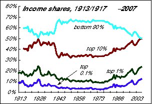
The first graph I will share is the share of income received, I won't say earned, from the early 1900s to 2007 by those in the bottom 90%, top 10%, top 1%, and top 0.1%. Remember that the figures for the top 10% include those of the top 1% and 0.1% and those of the top 1% include those in the top 0.1%.

The graph speaks for itself, but for the post World War 2 period until the late 1970s/early 1980s, income for the bottom 90% was about 2/3. During Reagan, and later, the wealthiest 10% claimed a greater share of the income produced in the US, to the point that they receive about 50%. The dip in the end of the series is the 2000 recession. Clearly eight years of Clinton didn't hinder the trend of the rich getting more. One other thing to call out is that much of the change in the income share of the top 10% is due to increases in the top 1%. This will become obvious below.
What is not shown is the shares for those in the bottom 50% or even 20%. Based on other things I read, my guess is that those shares declined as well.
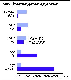
The next chart shows the percentage gains in income by group for the periods of 1948-1973 and 1982-2007. Both are 25 year time periods and the first period reflects the post-World War 2 economy while the later represents the last 25 years (since the data set goes up to 2007.)

Clearly the bottom 90% saw a doubling of their income in 1948-1973, but a much smaller growth in 1982-2007. Even the bottom 99% did better during 1948-1973 than in 1982-2007.
Clearly, the big winners were those in the top 1%, especially the top 0.01% who saw their incomes quintuple during the 1982-2007 period.
So if you aren't in the top 1% and you are wondering where yours went, you know who got it.